first steps to interactive fun using CouchDB

visotank-first-python-dev-sparkbars1.png

First, let me say that Pylons with its Paste magic is delightful; lots of nice round edges helped me get something simple up and running in no time, and using genshi to boot.

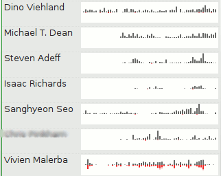
The new tool, visotank, is ingesting the python-dev mailman archives (as previously visualized) and putting them into CouchDB. The near-term goal is to allow for interactive exploration/visualization of the archives. The current result, as pictured, is simply sparkline barcharts of people’s posting history. Left-to-right, present-to-past, weekly, one (vertical) pixel per message, truncating at the image height (12 pixels).

Although the input processing thus far is specific to mailing list archives, the couchdb schema in use is for generic e-mail traffic. The messages are even coerced into rfc2822 format for ‘raw’ storage.

The ability to use ‘map’ multiple times in couchdb views to spread information is delightful. What I really would like is more reduce functionality or, more specifically, just accumulate. The sparkbars get their data from statistics with keys [contact id, timestamp of time period] and value 1, one per message. I would love for couchdb to provide a way to aggregate all those values with identical keys into a single row with the sum as the value. I’ll look into this and the view implementation before writing any more on the subject, but if someone out there already knows a way to do this, please let me know.

visotank-first-python-dev-sparkbars2.png

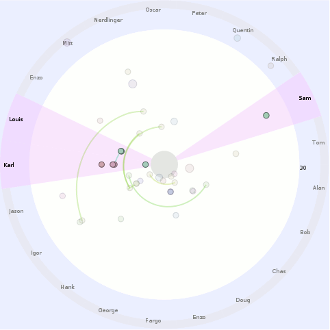
radial (radar) email vis, with care factors

radial-care-factor-vis.png

It’s a radial e-mail visualization intended to be the basis for a “situational awareness” overview of your e-mail. I’ve added the beginnings of a ‘care factor’* (“do I care about this person/message?”) concept to messages and contacts, which is used to assist in focusing your attention only to messages/people you care about. Right now, the care factor is simply whether you have ever sent the contact/author of a message an e-mail directly (to = 1.0), indirectly (cc = 0.5), or not at all (nada/ninguno=0.0). That can obviously be expanded upon in many directions; involvement of people you care about in message threads (with that person), intensity of your communication with that person, explicit interest-levels via tags, social network propagation (Google’s OpenSocial) without the person previously having existed in your e-mail corpus, etc.

Some more details about the visualization:

  • Things close to the center happened more recently. Things further away happened in the past. This seems like the most reasonable ‘radar’ metaphor for e-mail. If we were dealing with to-do items with due dates, then it would make sense that they are moving inward. However, the reality of e-mail is that if you don’t deal with them soon, they ‘fall off your radar’. My first thought to fuse the two would be to have messages associated with to-do tasks stick out quite obviously, latch once they hit the ‘edge’, and generally grow more ominous and threatening as time goes by. Of course, it’s probably not helpful to make people’s to-do lists seem like something they can’t escape…
    • The central grey circle is a void to ensure that angle is still meaningful even when the time is at a minimum; otherwise things would stack up and be generally extra confusing.
  • The angle is mapped to a single author/contact. This is currently random, but my intent is to allow clustering of contacts and quasi-persistent angular locations. So messages from your family might tend to come from the North, your friends the East, mailing lists the West, and ads from the South. (Let’s assume you get no spam.)  Actual geographic relationships would be a neat trick, but practically foolish.
  • Messages with a low care-factor are made more subtle by having reduced opacities. I forgot to make the edges linking messages to their parent more subtle…
  • Contacts with a high care-factor get their (anonymized) name in a strong color and their slice of the pie highlighted with a color. Contacts with a low care-factor have their names displayed more subtly and just get a grey hue for their outer-ring marker/label. The intent with the slice coloring is mainly to be intensity based with only one or two hues in use; I think using more colors will quickly overwhelm the display.
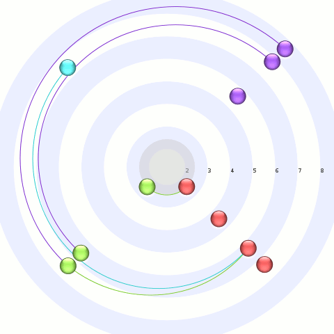
  • Time markers are in use, but may not be obvious. The blue ring labeled ’30’ (along the x-axis) indicates that’s October 30th. The inner white ring is November 1st, but I’m not clear on why it wasn’t labeled as such (aka bug). The time marker logic needs to be refactored to provide more usable single “ruler” labeling (the timeline use currently is biased towards 2 rulers, which is where the month and year went). See the test program output from below for a better example of time display, although the month/year are still AWOL in another ruler.

radial-blah-blah-blah.png

And there’s the test program. Note that edges connect a message to its parent, and currently always flow clock-wise for time. So the innermost red message is the parent of the inner-most green message. I’m a bit conflicted about this; the consistency is nice, but the relationship would probably be more obvious if we took the shortest path. Also, since e-mail reply relationships are causal, it’s not like there’s any doubt which message was a reply to the other.

* I say ‘care factor’ because I did this work on a red-eye flight where my tiredness overwhelmed my natural defense against puns, and since Halloween was recent, and there was that tv show called ‘scare factor’, etc. etc.

some email analysis for some email visualization

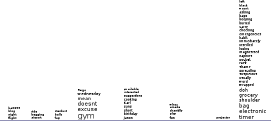
An attempt to apply hidden topic markov models to e-mail to perform topic analysis has morphed into simply deriving (aggregate) word-frequency information for TF-IDF purposes. The e-mails I attempted to analyze from my corpus appear to simply have been too short and wanting for quantity to pull a rabbit out of the (algorithmic) hat. (I only threw e-mails amongst my ‘village’-tagged contacts, as previously visualized.)

poor-mans-themail-but-hey-first-pass.png

Luckily, there’s a lot you can do with such information. (And in fact, I ended up using the word frequency info to attempt to normalize out e-mail signatures since I didn’t feel like doing the right thing for signatures at the time.) The bad news is I am not doing anything polished or good with the info yet.

The above is a quick proof-of-it-kinda-works which apes Themail‘s monthly words concept. If you’re not familiar with Themail, click the link, read the PDF. It is/was a covet-able research prototype that let ‘you’ explore your history, e-mail-wise. It’s not available for download, hence ‘was’, and was only available to participating subjects, hence ‘you’. The good news is that, as always, you can download my hacked-up version of posterity and my visterity plugin. I wouldn’t try using it if I were you, though.

conv-index-with-terms-as-databased.png

The second screenshot is my Inbox with the ‘best’ scoring keyword (using traditional tf-idf, not the themail revised metrics) displayed for each message where the histogram information is available. Since I only ran the processing code against a set of my contacts, only messages involving those people have a keyword displayed.

I’m going to try and pull in my old pre-gmail email into the system to try and get some more (personal) data to work with. Or, people who are not spammers, e-mail me so I have some more correspondence. sombrero@alum.mit.edu. Conversations about why the Pet Shop Boys are the greatest band ever are preferable. Eventually I’ll try and pull in my gaim/pidgin logs which would be more useful, but that’s arguably a different data case with special needs, and I’m already spread pretty thin focus-wise as is, so that will have to wait.

Anyone going to InfoVis 2007? And a dubious contact vis.

I’m going to be at Vis 2007/InfoVis 2007/VAST 2007 next week thanks to my employer, The PTR Group (who is hiring, especially embedded folk in the greater DC area). So, if anyone who reads this will be there, feel free to drop me a line in the comments below or via e-mail at sombrero@alum.mit.edu.

magneto-contact-vis-dubious.png

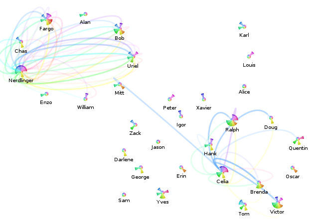
The above is an attempt to visualize the per-month message flows between contacts, originally drawing inspiration from iron filings in a magnetic field. It doesn’t really work, even filtering things so only messages between the contacts involving “Nerdlinger” (upper left quadrant) and “Celia” (lower right quadrant) are displayed.

The Celia one works out a lot better, as you can see. Please overlook the fact that somehow there are all sorts of messages from Celia during that blue month with neither her nor the other contacts having any meaningful message traffic per the pie-chart. (The filtering constraint is that the contacts of interest have to either be in the to/cc or the from part.) This is a result of a bug in my contact consolidation logic (now fixed), that resulted in the summary statistics not properly being updated in all cases. Recalculating the statistics isn’t going to happen tonight, so this screenshot shall forever be buggy.

What I take away from this visualization is that when attempting to indicate the relative proportion of messages between contacts across time, it would probably be better to use a single straight rainbow line. I define a rainbow line as a line made up of multiple colors; I’m sure there’s a better (pre-existing) term for the concept.

revised-me-relative-sparkbars-redblue.png

And these are some of the newer sparkline bars that only include messages to-me-from-the-contact (above: blue for to, light blue for cc), or from-me-to-the-contact (below: red for to, pink for cc). The color scheme is a red-shift (away from me)/blue-shift (towards me) sort of metaphor which no one (cooler than me) should ever guess. I think I’ll have to resort to text or icons, or just stop trying to cram so much information in there.

visualizing contact relationships

anonymized-contacts-village.png

First, there’s bad news on the shiny front. Although I made the SVG renderer capable of producing the gel-like circles, Mozilla’s SVG support currently lacks the features to do it as implemented. (Curse your full-featured-ness, Eye of GNOME!) Hopefully someday soon, it will support the synthetic BackgroundImage filter input (bug).

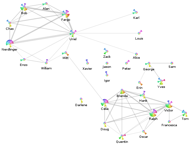
Our show-and-tell for the end of this weekend is a screenshot of the anonymized visualization from my Posterity contacts page for my ‘village’ tag (using my visterity plugin):

  • The nodes represent the contacts tagged with ‘village’.
    • The pie-slices represent the activity of the contact overall for the last year:
      • Each pie slice corresponds to a month. The current month is the slice just below due east, and we go back in time as we rotate around clockwise. The oldest month is just above due east.
      • The radius is a clamped linear scaling (over all nodes displayed and all months) of the number of messages sent by this person to anyone (including me).
      • The color is just a consistent hue-variation designed to look pretty. I was actually planning to use a single color whose saturation was at max for the current month and decayed to black for the oldest month. That arguably would reduce confusion as to what pie slice means what.
    • The labels are anonymized. There’s a mapper in there that maps people’s actual names (eventually nicknames) to what you see.
  • The edges represent e-mail messages sent from the displayed contacts to the other displayed contacts. Since I did not add my contact to this label group, this means I have no impact on things.
    • The edge widths are a linear scaling of the number of messages sent from the one contact to the other. Because the edges are actually directed, there may be two edges between two nodes which will overlap. Because the edges are not fully opaque, you should be able to figure out if the communication is at least symmetric or asymmetric.

Interestingly, you can see that the two major clusters of contacts are linked by ‘Mitt’ and ‘Celia’.

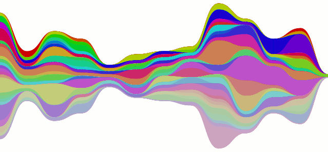
mailman-flow-whoknows.png

Er, so, every post gets two pictures, and there’s your second one. It’s the stacked line-chart being all curvy instead of not (curvy). The data is from the mailman feed, although I don’t think it’s actually supposed to look like that… the colors could also use some work.

contacts, tallies, sparklines, but no clever title.

sparkbar-contacts-others.png

I have hacked up my local posterity bzr branch to process messages to extract contacts (and mailing lists). These contacts result in synthetic tags (to, from, and cc) applied to each message. My changes also include maintaining per-time interval (day, ISO week, month, year, ever) sparse counts for each tag.

Visophyte (bzr trunk) has been augmented to create bar-graph style sparklines (as coined/created/etc. by Tufte). Visterity, my happy-go-visualizy posterity plugin (also in the visophyte repository), consumes the new posterity contact statistics and produces what you see above.

sparkbar-contacts-me.png

If you’re not sure what you’re seeing, each bar is a week. The grey-colored bars ‘above’ the invisible line are messages from that contact (to anyone). The red-colored bars ‘below’ the line are messages to that contact (from anyone), while the lighter-red-colored-bars below the line are messages cc’ed or bcc’ed to that contact (from anyone).

It is important to reiterate that, at this time, these from/to/cc relations have nothing to do with the person whose email repository it is (mine, in this case). If messages are red, that doesn’t mean I sent them the message; it just means someone sent them a message and it somehow passed through my account. Of course, when viewing a list of contacts, I’m only really going to care about that person’s interactions with me. So that is a must-have and up on the near-term to-do list. The current set of tags are really most useful in attempting to visualize messages sent through a mailing list or other broadcast medium, which is also of great interest to me.

I should probably also note that when writing the list-handling logic here, I forgot to have the code generate an implied ‘to’ when the person replied only to the list but the author of the previous message could be presumed to be the intended recipient of the message. Which explains why so many of the people in the example image up there do not end up receiving many messages. I would have fixed this, but re-processing my full downloaded gmail corpus of something like 68,000 messages takes a while.

Also, the blurred out guy in the example doesn’t need to be blurred out. I ended up eliding a useless column that I had decided to blur for no clear reason, but in my sleep-desiring state I also screwed up and blurred a column that really didn’t need to be blurred. (All the people shown have posted to public mailing lists, so their e-mail addresses are already out their, and their names aren’t exactly going to get them more spam. And OCR would be required anyways, as the sparklines are images rather than inline-SVG for caching reasons.)

UPDATE: Uh, as I quickly re-read the post and looked at the sparkline, I realized I completely flipped (both color-and above/below) the sparkline from what I had originally intended.  Thankfully my original intent didn’t make all that much sense either, at least color-wise, so I think I can sleep easy without correcting that.  Better color suggestions,etc. are appreciated.

Click your way to health. Oh, and email visualization.

The SVG renderer is in and brought with it much refactoring of the renderers. Cairo still works. But what does this buy us?

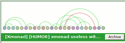
visterity-conv-threadarc.png

It buys us a working clickable demo of posterity with the visterity plugin. And a second one too. (You probably need to be using Firefox for it to work. And one with SVG support to boot. Firefox 2.0.0.6 on Ubuntu gutsy definitely works at the minimum.)

Oh, I should probably clarify “working”. I used Firefox’s “Save Page As…” functionality so you get the same experience I got when browsing that page. But if you think you can click on any of the other links and read my e-mail, you will be sadly disappointed.

visterity-conv-timeline.png

For the unadventurous, I will tell you what you could do if you clicked on either of those images:

  • The circular nodes have title attributes with the name of the author of the email, so if you hover you get a tooltip with their name. (Not fancified, but it could be.)
  • Clicking on the circular nodes expands the e-mail in the conversation and smooth-scrolls you to that e-mail.

It does not get you any form of connection in the opposite direction. So as you move your mouse over the message headers, the messages in the visualization do not light up. However, I probably wouldn’t be bringing that up if I didn’t plan to address it. I mean, who would do that and make themselves look bad? Not me, certainly. I’m cagey.

Oh, and please keep in mind that these visualizations are not intended to be polished in any way shape or form. In fact, it took all of 5 minutes to throw the time-line vis together, which would explain why the use of color is rather redundant. (It would be okay if I had an animated transition between that visualization and another visualization. But I don’t. It turns out I’m okay with making myself look bad.)

a posterity-based email visualization says what?

Exactly.

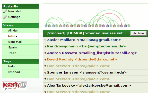
posterity-hooray-hooray.png

It’s posterity, the exciting new Python mail client (as web server) with some mods (that’s my bzr branch) to support plug-ins slightly more and new chrome ‘decorators’. Into that we have plugged “visterity”, a new visophyte-ish thing. (Found in the visophyte bzr trunk under src/visterity-py) This works with the cairo renderer (so have python-cairo), and may work with the aggdraw renderer, but I haven’t tried it and make no promises.

To elaborate on the graphic, it’s posterity’s conversation view with the visterity plugin providing a png at a chrome decoration point (‘conversation’, ‘top’). It is not yet click-able! It is most definitely not responsive to what the current message you are dealing with is. However, those are the next steps!

I will likely implement a mixed svg/js renderer that should then be able to interact bidirectionally with posterity. This is what I have been hoping to do with Thunderbird but have been punting on because it involves a degree of pain/difficulty that is hard to justify given my limited hobby-programming time. However, Thunderbird is still on the map and I will attempt to ensure the implementation is general enough that I can plug it into Thunderbird as well.

Cairo bakes Pretty Pies

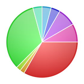
Vacation found me actually relaxing, but some pretty progress has been had. I forgot to push my 64-bit aggdraw patches to the laptop I brought, so I implemented a cairo renderer. This has resulted in some backend cleanup and refactoring, although there is more to do. This also allows for attractive use of gradients:

pretty-pie.png

The changes to the pie-chart rendering are based on an Illustrator tutorial on how to make pretty pie charts. Although the pie chart has long known how to label itself and is now more competent at it, labels still overlap so they have been mercilessly disabled in this picture.

pretty-graphito-pies-python-dev-2007-july-twopi-fancy.png

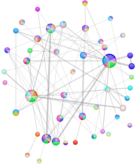
This is a graph of the python-dev traffic (from the mailman archive) for July 2007 once more. This time:

  • The nodes are authors.
    • The radius of the node is a linear mapping lower bounded at 8 and upper-bounded at 24 based on the number of messages the author wrote during the time period.
    • The pie slices are the threads the author replied to/started during the month.
      • Their weights are the number of messages they wrote involved in that thread.
      • Their colors are distinctly colored. Because the previous distinct color mechanism clearly fell down by providing colors which were too similar, I did a first pass at varying the saturation in addition to varying the hue. Varying value/brightness seemed a little too distracting, but it might be okay with less severe variations.
  • The edges indicate that the author replied to a message by another author.
    • The width is (linearly) based on the number of times the user replied to the other author.
    • The color is always 25% opaque 50%-gray. Since the edges are effectively directed (but not visually distinguished), a case in which two authors replied to each other will result in a darker gray, at least in the region of overlap (since width can vary).
  • The layout is graphviz‘s twopi.

python-dev mailman archive thread-arc visualizations

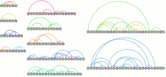
What’s new? Mailman archive processing! Bezier segmenting for more accurate arcs (thank you Luc Masonobe)! Pseudo-thread-arcs! (Actual thread arcs as visible on the whoa-awesome-but-why-aren’t-you-released-software ReMail project would seem to more practically squash ridiculously-large arcs and of course leverage the other side.)

python-dev-july-2007-threadarc-assembled.png

  • Node colors are per-author. The middle bottom thread demonstrates the need for a smarter distinct color logic, as I’m pretty confident that thread isn’t the result of one person with multiple personalities.
  • Nodes are sequenced time-wise from left-to-right with uniform (pixel-based) spacing. I tried placing them by time, but things clump up pretty uselessly. Non-linear time scaling is on my list.
  • Arc colors are based on the subject, whereas reconstruction is based on the headers. As such, arc colors in a thread may change if someone changes the subject.
  • Arc width is constant, though I was entertaining varying it based on the amount of new content in each e-mail. Of course, there’s always knobs to tweak.

Please note that the above image is actually the result of re-arranging the contents of two separate images; the layout currently used just stacks them all vertically with a (dynamic) uniform spacing. For this reason, the rightmost threads are actually from a separate run where I set the ‘chaos’ filter with a much higher bar. Oh, and those are threads from the July 2007 python-dev archive, although without labeling you have no reason to believe me.

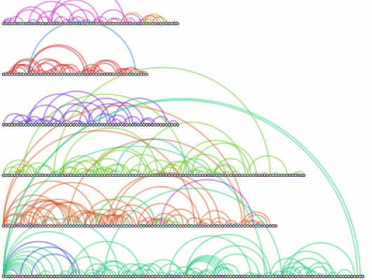
python-dev-2007-threadarc-chaos200.png

And this is the result of sucking up January-July 2007, filtering on threads with a ‘chaos’ greater than 200. (‘chaos’ being an arbitrary and arguably incorrect term for the total distance of all nodes from their parent (less one). So a thread where every message is just a response to the one that chronologically preceded it will have a chaos of 0. A thread where every message is a response to the message before the one that chronologically preceded it will have a chaos of (n – 2) where n is the number of messages. Apply algebra, rinse, and repeat.

I’m going to try and get this going with Thunderbird reasonably soon, but it might take longer than I’d hope. Thunderbird w/pyxpcom didn’t build clean on my amd64-arch laptop, chronicle-recorder’s valgrind crashes on amd64, and the like means some busywork on the horizon.