Chronicle-Recorder Graph/Ring Visualization! Hooray!

Thanks to new and improved time management skills (and a holiday weekend doesn’t hurt), I’ve got a chronicle-recorder visualization going on via chroniquery:

visichron.py trace vfancy -f smain

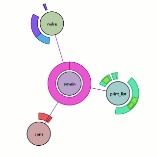
Above, we have the visualization run against the ‘fancy’ program seen in the previous chroniquery posts (with one caveat, addressed later). What does it mean?

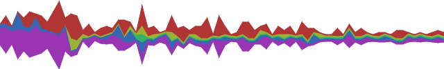
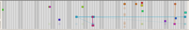
  • The circular nodes are functions in the executed program. In this case, we start from ‘smain’ and pull in all the subroutines that we detect.
  • The edges between nodes indicate that a function call occurred between the two functions sometime during the execution; it could be once, it could be many times. The color of the edge is a slightly more saturated version of the color of the node that performed the call. If they call each other, only one color wins.
  • The rings around the outside of each node indicate when it was called, specifically:
    • The ring starts and stops based on the chronicle-query timestamp. Like on a clock, time starts at due north and flows around clock-wise, with the last smidge of time just before we reach due north again.  This has its ups and downs. The reason we are using ‘smain’ instead of ‘main’ is that when we used the untouched main, the first “new” ended up taking up most of our timestamp space. So I turned main into smain and had a new main that takes the memory allocator start-up cost hit and then calls smain.
    • The thickness of the ring indicates the depth of the call-stack at the time. The thickest ring corresponds to the outermost function, the thinnest ring to the innermost function. This results in a nice nesting effect for recursive functions, even if it’s more of an ‘indirect’ recursion.
    • The color of each ring slice is based on the control flow taken during the function call. (I think this is awesome, hence the bolding.) Now, I’m making it sound fancier than it is; as a hackish first pass, we simply determine the coverage of all the instructions executed during that function call. A more clever implementation might do something when iteration is detected. A better implementation would probably move the analysis into the chronicle-query core where information on the basic blocks under execution should be available. Specific examples you can look at above:
      • print_list: The outermost calls are aqua-green because their boolean arguments are true. The ‘middle’ calls are light green because their boolean arguments are false. The fina, innermost calls are orange-ish because they are the terminal case of the linked-list traversal where we realize we have a NULL pointer and should bail without calling printf. They are also really tiny because no printf means basically no timestamps for the function.
      • nuke: Four calls are made to nuke; the first and third times (light blue) we are asking to remove something that is not there, the second and fourth times (purple) we are asking to remove something that is. I have no idea why the third removal is so tiny; either I have a bug somewhere or using the timestamps is far more foolish than I thought.

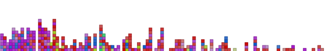
Besides the obvious shout-out to chronicle-recorder, pygraphviz and graphviz power the graph layout. Now, a good question would be whether this actually works on something more complex? Could it be? Well, you can probably see the next picture as you’re reading this, so we’ll cut this rhetorical parade short.

visichron.py trace chronicle-query -f load_all_mmapped_objects

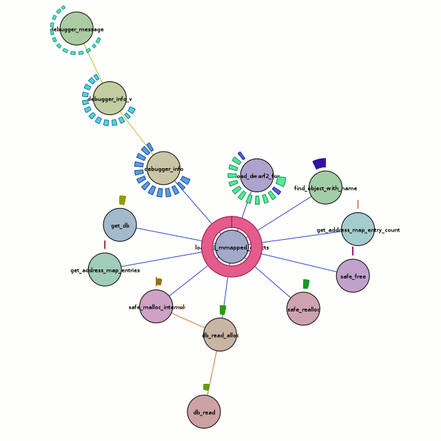
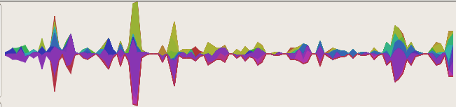
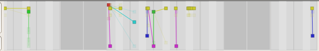
Besides the obvious font issues, this actually looks pretty nice. But what does it tell us? Honestly, the full traversal here is excessive. All we care about is the center node, load_all_mmapped_objects, and load_dwarf2_for (due north and a teeny bit east of the center node). If we look at the calls to load_dwarf2_for, we can see that two of them have different control-flow coverages. Those happen to be the times debug symbols could not be found (which is my problem I want to debug). The first one is for ld-2.6.1.so (I’m looking at the textual output of chronisole for the same command), and the second one is for /usr/bin/python2.5. The second one should definitely not fail, because it should find the symbols in /usr/lib/debug, but it does.

Unfortunately, the trail sorta stops cold there with a bug in either chronicle-query or in chroniquery (possibly cribbed from chronomancer). load_dwarf2_for should be calling dwarf2_load, but we don’t see it. I don’t know why, but I haven’t actually looked into it either. Rest assured that a much more awesome graph awaits me in the future!

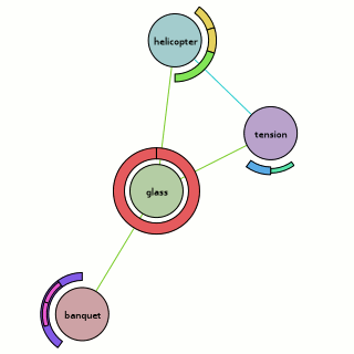
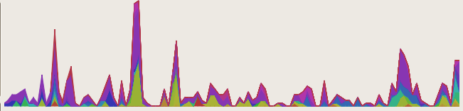
Because there’s too much text and not enough pictures, I’ll also throw in the output of the ring visualization test which uses a stepped tick-count (1 per function call) to show how things could look if we went with an artificial time base…

ring visualization example

Bzr repositories for both can be found at http://www.visophyte.org/rev_control/bzr/.

some practicality comes to visophyte town

In a nod to making useful visualizations, the marker infrastructure has been beefed up. The linear mapper now has reasonable heuristics to use pretty round numbers. And the time mapper has all sorts of time ranges under its belt.

weather vis demo, year time range

While I have thoughtfully left out units, there is now at least a chance of someone guessing that the above is a graph of the high, average, and low temperatures for somewhere in some year. Maybe someone really fancy could narrow it down by figuring out when the various inconsistent holidays fall and the overall temperature trends. But I’ll spoil the fun; it’s Dulles, VA in 2006! Thanks to a CF6 ‘Preliminary Climatology Data’ parser/’data feed’ we have a limitless* source of data which is only good for examples. Also, thank you weather.gov.

weather vis demo, june

This one is just the month of June. The non-intuitive numbers are ISO weeks. Overkill demands the ‘rulers’ that provide the date ranges eventually be capable of visualizing data themselves**, but for now they just derive their colors from primitive theming support which is also new.

I should probably note that I have begun to push my bzr repository to this server (/rev_control/bzr/visophyte) simply because I can’t think of a reason not to. The visophyte code proper is LGPL v3, but examples are MIT/X11 (though they need to be more explicitly labelled as such). That said, the code is still in an aggressive state of flux and I suggest no one even bother looking at it. Simply put, I keep adding features as needed, and the waves of non-backwards-compatible constraint/feature propagation often need to ripple through the entire codebase. And when I say ripple, I mean ripple; it’s not instantaneous.

* For the purposes of this asterisk, limitless still involves limited cutting and pasting. The parser likes to read files, not interwebs.

** Although I am likely to use such functionality to render the rulers useless and somewhat gaudy, there are sane possibilities too.

Chroniquery: Chronicle-Recorder and Python Boogie Down

Robert O’Callahan‘s Chronicle-Recorder is one of the most exciting debugging tools to come down the road ever. In order to help me track down my PyXPCOM problem that has been a stumbling block to full Thunderbird integration, I’ve laid the groundwork for a nice Python-based interface to chronicle-query.

chronisole output on loopy

You can find it in a bzr repository at http://www.visophyte.org/rev_control/bzr/chroniquery/

It depends on some mods I’ve made to chronicle-recorder which can either be found in my (st)git repository (git-svnimport’ed) at http://www.visophyte.org/rev_control/git/chronicle-recorder.git/ on the acs-base branch. I have no idea how to have someone branch the repository and get stgit to actually understand the patches, so I have also exported the patches to http://www.visophyte.org/rev_control/patches/chronicle-recorder/. They should apply cleanly to rev 13/15 of the trunk. In a nutshell, the patches make things work with a somewhat-up-to-date Ubuntu gutsy (7.10) install, add the ability to retrieve information on compilation units including their memory offsets, add the ability to get source line information (with some overkill on determining the end of the current ‘line’), and a bugfix for negative line offsets.

It’s my understanding from roc’s blog that he’s been working on a proper debugger interface, so some of these patches may be redundant or otherwise rendered moot.

The picture above is a screenshot of Firefox rendering the styled HTML output of chronisole.py run against the loopy.c program in the chroniquery examples dir. (Click on the picture to go to the HTML.) It’s like a fibonacci generator, but it’s not. If you run chronisole in a terminal without the HTML args, it will output the equivalent, but you need to have a 256-color xterm. To summarize its actions, it finds all the compilation units residing in the executable which have low_pc/high_pc info and uses that as the basis of the ranges of interest for an instruction scan. It loops over the source-lines as they are executed in sequence, grabs the lines, and looks up the values of the locals just after the source line completes execution. If each local’s value differs or was not in the previously executed line’s locals, it gets to be yellow, otherwise it is a subtle color.

Thunderbird stacked linechart visualization

Stacked linechart visualization of j-devel by sender, march 05 through june 06, no sustain

The last post‘s visualization is put to work here visualizing the traffic on the j-devel mailing list (for the j text editor, but also beloved for armed bear common lisp) from March 2005 through now, June 13 2007, clustering on 7-day intervals. Each series is a specific author. ‘Sustain’, or the number of pixels of space to give to each series that doesn’t have traffic is at 0 because the number of one-time posters turns things into a mess of a lie. In the last post, sustain was at 2 because it made things prettier without significantly distorting the data. Decay might be a good compromise, although still introducing some distortion; really, the visualization then becomes a graph of ‘perceived activity’.

Not too many changes to do this; added a polygon renderer to the mozilla svg renderer backend and implemented an extremely naive type-dispatching in the thunderbird datafeed provider to fall back to the native python dispatcher so that it can process the aggregate nodes.

I should also note that there are just enough posters to the list to make the fallacy of using consecutive HSV points for consecutive data-series without additional variability a bad idea. At the bottom the two purplish colors pretty nearly blend together. Since the series may appear and disappear at will, it’s not sufficient to just hop the saturation or value between two values for alternating colors. Probably the thing to do is to ensure a minimal distance in the color-space and either spiraling in through the color wheel or just have multiple circles on the color wheel. We run out of usable colors eventually there too, but we can always fall-back to a graph-coloring algorithm to cheat and provide sufficient contrast between more closely spaced colors (in color-space; and forget perceptual color-space).

UPDATE:

Stacked linechart visualization of j-devel by sender, march 05 through june 06, no sustain, bottom align

Er, so, looking at the visualization a little more, I realized if I’m going to talk about distortion, I should probably admit that the naive centering-layout algorithm probably hoses things up too.  So, to my loyal readers entirely consisting of people foolish enough to click on links I send them via IM, you get a bonus visualization which is the exact same thing as the above, but with the alignment routine set to ‘bottom’, which is arguably more accurate.

Blog vis with trendy stacked linechart

Frinkiac WordPress Shoutbox Stacked Linechart Flat Coloring

So, motivated by recent prettiness (C26000’s Last.fm Extra StatsWave Graph‘ and its inspiration Lee Byron’s Layered Histogram, which also reminds me of the fundamentally different but visually close-enough IBM Research/Viégas/Wattenberg’s history flow), I have put in some preliminary aggregation logic and a ‘stacked linechart’ visualization. It’s quite the poor cousin to Lee Byron’s stuff, but we’ve got to start somewhere.

Although histogram is probably a better term for the result, the visualization is actually ignorant that there’s aggregation going on, so stacked linechart it is. The data is the same data (wordpress shoutbox ‘shouts’) from my last post, but instead of block stacking to get a de facto histogram, the binned time-intervals are aggregated by author. The stacked linechart consumes these and — presto — a de facto trendy histogram. The main difference here is that the bin period is 7 days, although bugs remain. I am going to replace my haphazard date logic with python-dateutil shortly to resolve this problem.

Frinkiac WordPress Shoutbox Stacked Linechart Link Tally Coloring

Of course, the whole point of visophyte is (excessive) flexibility, so let’s at least leverage that. The above is the same data, but with the fill’s saturation varying with the total number of hyperlinks included in ‘shouts’ for that time interval, producing a quasi-retro wire-frame effect.  Stronger/bolder colors = more links, lighter/faded colors = less/no links.  Some day, perhaps a pretty spline version, but up next is getting back to Thunderbird.

A return to blog visualization, kinda

Frinkiac WordPress Shoutbox VU-Style Vis Mark 1

A visualization of the shoutbox traffic on www.frinkiac.org since the dawn of time or the blog, whichever came later. Colors are defined by the ‘shouting’ user (hue), the linearly scaled log of the word count of the contents (saturation), and a constant for value to get darker lines. So ‘brighter’ colors = longer shouts and ‘lighter’ colors = shorter shouts. All colors are regrettably ugly. The dawn of time is on the left, modern times is on the right. I think the clustering routine has decided each column is three days, although that may get a little shaky at the end of the months (quick-n-dirty date logic.)

This should look similar to…

Old Movable Type Koala Rainbow VU Vis

ye olde KoalaRainbow 0.* for MovableType. The MTKR one is actually blog posts and comments and doesn’t distinguish based on the author, but the point is that I am beginning to be able to do all the things I used to be able to do. This helps flesh out the set of base visualizations and ensure that the architecture doesn’t have any obvious holes in things. Although the visophyte vis definition is perhaps still more verbose than I would like, it doesn’t make me lose hope like the procedural MTKR one did (click on the latter picture and scroll down to witness the ugliness).

the beginnings of a gdb execution trace visualization

GDB execution trace vis 1

Python code driving gdb via the mi2 interface (using pexpect and pyparsing) begets a trace file. Python code processing the trace file begets an html document (with syntax highlighting thanks to pygments.) The above is just a screenshot of the output, which you can actually browse here.

The “visualization” is pretty simple. Lines of code with a light green background were executed in the trace. 15 lines of context are shown around executed lines of code. The bars to the left show when the line of code was executed during the trace. If the code was a function call, its bar is extended until the function call completed based on conclusions drawn from knowing the stack depth at each step. There is currently no way to visually distinguish from the graphic between a line executed many times in rapid succession and a call that lasted a long time. You would need to either look at the code or cheat and use firebug.

The visualization is of a call to commit() using pysqlite2 on sqlite3 which fails because of an outstanding select that has not yet had all its rows retrieved. My conclusion is that clever generator tricks (not mine!) can bite you when any piece of your stack has concurrency issues… and pysqlite2 should report the most specific error string possible. (Going to provide a patch; still think the trunk would provide the rather generic error that bit me.) For those using trac’s version control abstraction, be warned that changeset traversal is most definitely a (logic) generator wrapping a row-results-fetching generator.

GDB execution trace vis 2

The tracing mechanism is pretty straight-forward. The tracing class is told an interesting breakpoint and an ignore count. Once the count has been reached, “step” tracing begins. The idea was to do a first pass that just counts how many times the interesting breakpoint occurs before the program tanks, then we can skip to the last few before doing the (slow) step-wise tracing in the second pass. The goal would be to approximate a light-weight tracing mechanism where we can see what the program did before whatever bad state occurred. Gah! I was just going to say that there aren’t any open source tools readily available to accomplish that goal (dyninst/dpcl still require a bit of legwork), but it turns out that Chronicle (formerly Amber) has recently been released. (For whatever reason, Robert O’Callahan’s post didn’t show up in his feed via planet mozilla for me.) OTOH, this method is still potentially useful for remote gdb target debugging on actual hardware (albeit extremely slowly), or perhaps for a case where the program must do a lot of execution before the interesting part of the trace happens, lending itself to a non-valgrind solution. I presume you would pay the simulation price for valgrind the whole way through, unless valgrind can ‘absorb’ a running process into its simulation.

I also have a visualization done using visophyte’s model abstraction (if you are going to go and invent yet another multi-backend canvas abstraction layer, you might as well use it), but without some way to view the corresponding code and explore, it is useless. The generated HTML here is more useful, but still lacking in interactivity or true context. That would be the next step. The step after that would be throwing back in a concise and interactive visualization. The same effort required for that should allow me to produce interactive visualizations from thunderbird.

An actual thunderbird email visualization, at last!

I have long had the goal of doing some form of e-mail visualization. After many false starts (for both Thunderbird and Outlook), I finally have something to show:

Graphito vis example 2

Now, of course, there are all kinds of caveats. This is all done in Python using PyXPCOM and PyDOM (hooray Mark Hammond!) The bad news is that the Python code is still unable to interact with the JavaScript pieces of Thunderbird. The good news is Mark Hammond already has a solution to allow Python and JavaScript to interact somewhat transparently (on bug 327689). Unfortunately, the patch does not work out of box for me, although it may be due to some underlying PyXPCOM problem that I still need to look into; I can’t even instantiate the error number service via PyXPCOM.

Since I haven’t implemented the labelling required to make the screenshot remotely intuitive, here’s an explanation of the visualization accompanied by a simpler picture generated by a test program using static data and the aggdraw renderer (no Thunderbird involved for this one):

Visualization using aggdraw to render from test data.

  • Time flows from left-to-right, old-to-new.
  • The background represents the days of the week and standard 9-5 business hours. Dark grey for the weekends, lighter grey for the week days, and then bands of even lighter gray for the 9-5 business hours on week days. The background should simplify when dealing with larger time-scales, but that’s down the line.
  • Nodes are placed vertically so that each horizontal strip corresponds to a single e-mail address. All nodes are colored based on their author.
    • Opaque squares represent an e-mail from that person (the one who owns/is the strip) to me, the user of the program.
    • Alpha-blended squares represent that person receiving a copy of the e-mail (‘to:’ only currently).
    • Circles represent me, the user of the program, having sent an e-mail to that person. If I sent it to many people, they each were on the ‘to:’ line.
  • Lines connect an e-mail with the message it is in reply to. Alpha-blended lines accompany alpha-blended nodes.

The first two visualizations are from a somewhat recent trunk build of Thunderbird with python and svg turned on. I have omitted the rest of the Thunderbird window because I’d just have to blur most of it out anyways. The data-sets come from two different folders that I copied interesting sets of messages to (including the messages from the thread in my ‘sent’ folder). Because of the aforementioned lack of javascript interaction, clicking on a node does nothing. However, I do print out info on the message when you hover over it or click on it. This is actually specified via the visualization infrastructure, it’s the ‘control’ object which just prints it out in a debug fashion.

Filler visualization, also by visophyte, rather silly though.[1]

The visualizations are powered by the python ‘visophyte’ library which I have been developing. Visophyte is the successor to the koalaRainbow Movable Type plugin I wrote for the Movable Type 3.1 plugin contest. koalaRainbow (for MT) was more of a simple procedural drawing markup mechanism fronting a query-language than a visualization engine. Its visualization definitions were incomprehensible due to a lack of any real abstraction. With any luck, visophyte will suffer the excesses of too much abstraction. koalaRainbow (for MT) died because #1 I wrote it in order to learn Perl so that I could legitimately dislike Perl, and #2 I favor Python for all my scripting. Visophyte will enjoy continual development because I love visualization and I use python all over the place.

One important note from the outset is that although I am a fan of PyXPCOM, I doubt visophyte as it exists would be appropriate for an email visualization plugin for thunderbird that would enjoy wide usage. Developing a JavaScript visualization engine would be much less reusable for my purposes, so I’m not doing that. One possibility might be to compile the visualizations to javascript, optimizing them as we go, a la pyjamas.

1: This visualization is just here to break up the text. It is also a visophyte simple test, but rather silly. It is unlikely anyone would really want a line chart with pie charts at each point. The line itself shows total sales by month, whereas the pie-chart shows a sales breakdown among products for that specific month. A stacked area chart would be the ‘sane’ alternative to this graph, though we could have multiple lines/pies here, I’m just too lazy to make up the data.