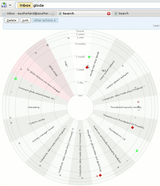
Thunderbird. With the global database, gloda. Using the exptoolbar extension. Using the protovis javascript visualization library. For reals! Not a prank! Just grab the most recent XPI or grab the repo. And be using a nightly (beta 2 might work?)
What you are looking at:
- The exptoolbar search results page, augmented with a visualization.
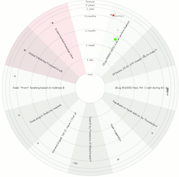
- Each conversation with search results gets its own wedge.
- Wedges can be distinguished because of the alternating background colors.
- Conversations that you sent a message to will have a red shading to them. The examples may be somewhat misleading because the account where a lot of my sent mail ends up is not part of the profile used to create the screenshots.
- Each message is placed in its conversation wedge…
- The radius is based on the ‘age’ of the message using a log-ish scale. Interpolation is actually linear at each level (one day, one week, one month, three months, one year, 5 years, ‘forever’.)
- The angular placement within the wedge is based on the author of the message. Across all wedges the placement is the same. This helps ‘bursty’ parts of conversations (which are extremely likely) be made more obvious, while also helping to provide some understanding of conversation dynamics.
- Message shapes are determined by whether the message is starred (diamond), sent by a ‘popular’ contact (circle), or an unpopular one (cross). The use of popularity is a temporary measure because current gloda in trunk does not cache address-book lookups, and they are expensive. Once the new gloda search code lands with those changes, we can rely on the existence of an address book entry. (Starring a contact using the new message reader adds them to your address book.)
- Message opacity is determined by whether the message is a ‘hit’ or not. All messages in a conversation are eventually retrieved, though initially we only have the hits.
- Message color is determined by applied tags (using the closest tango color for the first tag), or whether the message is starred (closest tango color to yellow, where I think I had removed the yellow tango colors for some unknown reason, so we get green I guess). It’s grey if the message has no tag or star.
- The subject of the conversation is displayed in the wedge.
Things that are happy:
- protovis is delightful, even at this early stage of its development.
- The radar-styled visualization looks fairly neat, and basically proves at least feature parity with my visophyte-based radar visualization.
Things that are sad (aka caveats):
- It would probably be better if the visualization was not radar-inspired. Besides the perceptual reasons, the subjects are harder to read than they would be in an equivalent linear-styled visualization.
- The visualization is not interactive. protovis officially has no interaction support yet, but if you look in the (only available minified?) source, it’s almost there. It might be entirely there, but it didn’t work for me immediately after a quick reading of the (indented) source.
- There is some low probability failure that occurs during the visualization updating as gloda backfills the message collections. If it happens on the last update, you can end up with a half-built visualization. Re-running the search will generally resolve the issue.
- The visualization does a pretty solid job of taking up all the screen real estate and has no way to be disabled, so you have to scroll past it every time.
Future work:
- Interactivity.
- Perhaps showing the gravatars for the people involved in a conversation at the outer rim of the wedge, positioning them based on the author positioning we determined.
- Perhaps lose the radar motif.
- Your thoughts / patches!

